A unified brand and digital system designed to bring clarity, structure and consistency to a multi-division facilities management business.
The Situation
Aligning Multiple Services Under One Clear Brand.
DCFM was built around a number of specialist divisions, each delivering a distinct service within the facilities management sector.
While the offering was strong, the presentation risked feeling fragmented. Without a clear and consistent identity, each division could easily be perceived as separate rather than part of a coordinated operation.
The objective was to create a brand that brought everything together. One that felt structured, reliable and capable, while clearly communicating the relationship between each service.
Key focus
Clarity across divisions|A structured and dependable presence|A brand that feels established from day one
The Exploration
Translating Operational Structure Into Visual Form.
The exploration phase focused on how to represent a business that operates through multiple connected parts. The identity needed to reflect coordination and control, without becoming overly complex or restrictive.
Different directions were explored to test how structure, hierarchy and movement could be communicated visually. Each concept approached the problem from a different angle, balancing clarity with flexibility.
CONCEPT 01 | Integration and structure, representing multiple services.
CONCEPT 02 | A linear and process-driven approach.
CONCEPT 03 | A simplified and scalable direction, focused on clarity.
The Direction
Developing a Mark That Reflects Coordination and Control.
The selected direction centred around the idea of integration. The concept provided a clear representation of multiple components working together, forming a single, cohesive system.
From there, the focus moved into refinement. The geometry of the mark was carefully adjusted to improve balance and proportion, ensuring it felt controlled rather than constructed.
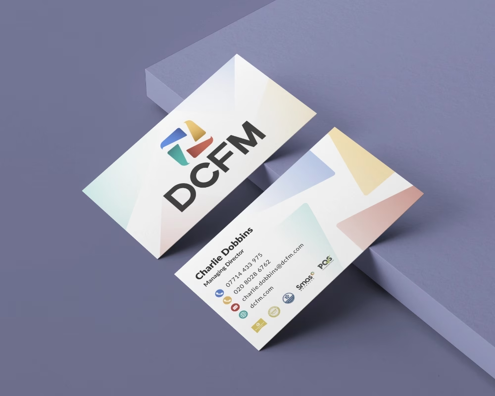
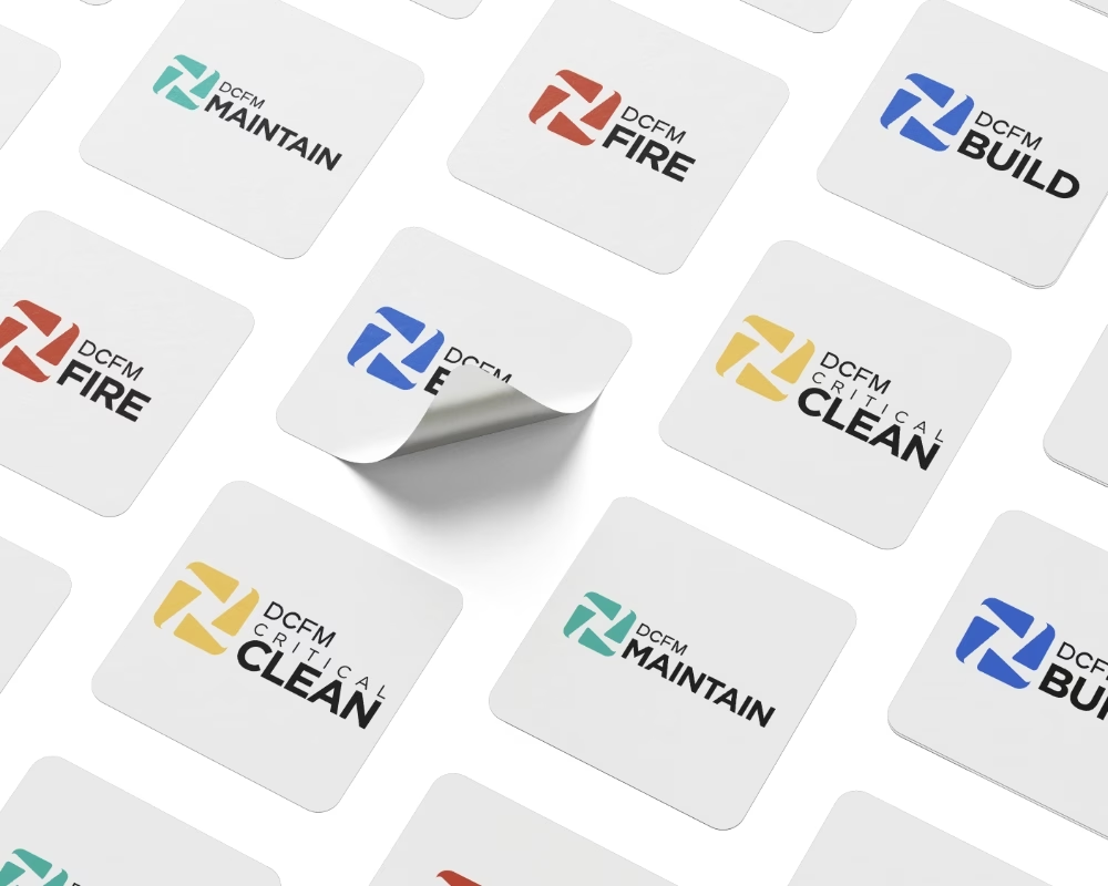
The identity was then expanded to support the wider structure of the business. A colour system was introduced to distinguish each division, allowing them to operate independently while remaining clearly connected to the main brand.
The Application
Extending the Facilities Management Brand Identity Across Digital
With the identity established, the next step was to ensure it could be applied consistently across every touchpoint.
A full set of division logos was created, each aligned to the core identity but differentiated through colour. This allowed the business to communicate multiple services clearly, without losing cohesion.
The website was then developed to reflect this structure, guiding users through the different areas of the business while maintaining a clear overall narrative.
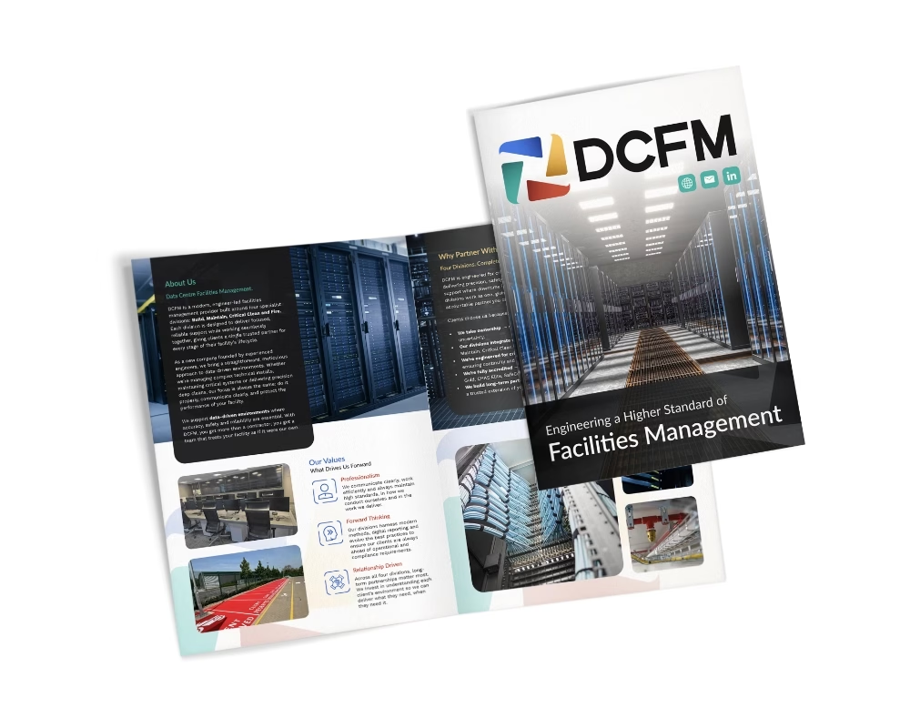
Alongside this, a digital brochure was designed to present the business in a clear and professional format, reinforcing the structure and credibility of the brand across presentations and client interactions.
Facilities Management Logo Design & Refinement
Following the selection of the chosen concept, the focus shifted to strengthening the structure of the mark and refining how it would perform across the wider brand system.
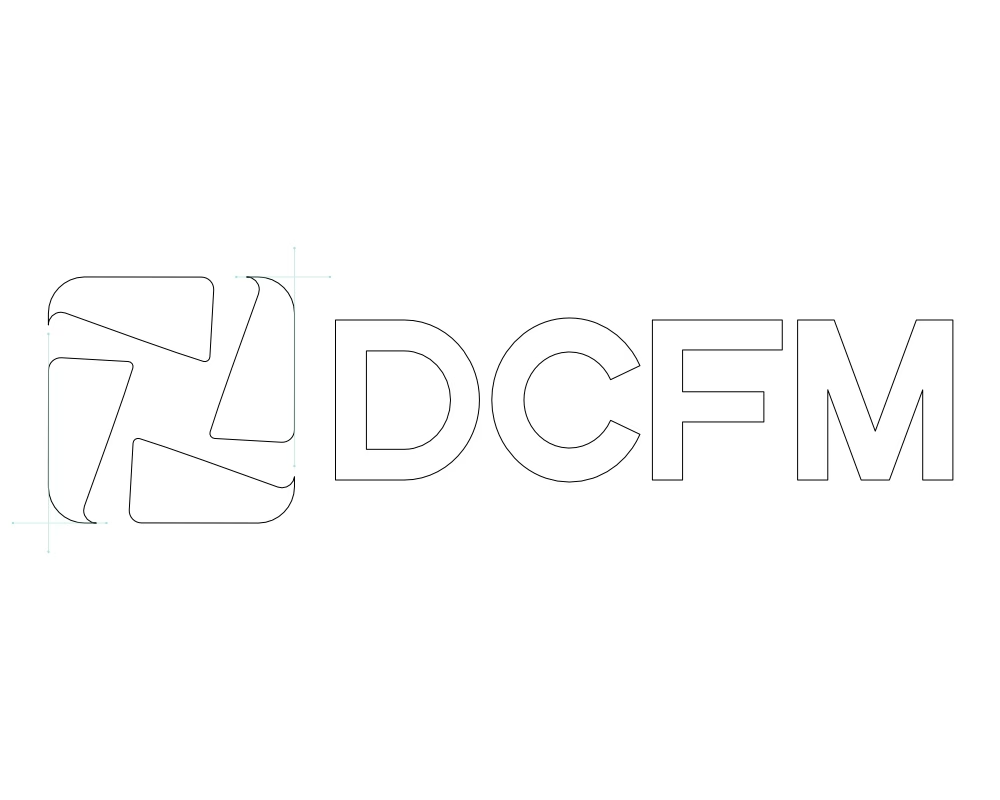
Working in vector allowed each element to be developed with precision. The proportions were carefully adjusted to improve balance and consistency, ensuring the mark felt controlled and well-resolved rather than assembled.
Particular attention was given to how the individual segments interact, reinforcing the idea of multiple components working together as one cohesive system. The form was refined to improve clarity and impact, while maintaining a sense of movement and connection.
Through this process, the identity was developed into a more confident and recognisable mark, capable of scaling across different applications while maintaining clarity and consistency.
The Final Identity
A Cohesive System Built for Clarity and Scale.
The final identity brings together all elements into a clear and structured system.
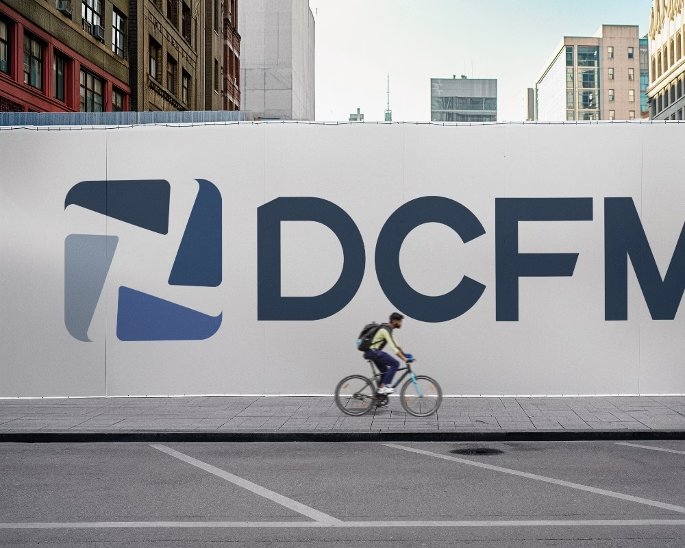
At its core is a mark that represents multiple components working in unison, supported by a clean and confident wordmark and a flexible colour system for each division.
The result is a brand that feels organised, dependable and built to scale, capable of representing a complex service offering through a single, recognisable identity.
A unified identity system, designed to bring clarity, consistency and structure to every part of the business.
Thinking About Your Own Brand?
If you’re looking to refine your identity or build something from the ground up, we can help you create a brand that feels clear, consistent and built to perform.